Coding can be complicated, when you are just starting it's important to take it step by step or you will end up in hell with a page in chaos. It's not that coding can't be learned, it definitely can, but as the saying goes practice makes the master. Hopefully we have the internet, to help us solve our problems. Some good websites are:
Thursday, December 7, 2017
lost in coding
One thing I appreciate knowing is that just as in life, if you don't keep your things in order you won't find them, same goes for coding. it gets worse if you have a code that makes sense and you have everything right but for some reason in the preview you get something completely weird, such as out of place, to the left instead then on the right, or even worse it doesn't even come up on the page.
It can be really frustrating, especially when you cant find your error. what you can do in such moments of pain (because it can literally give you pain) is take a step back and try to look more in detail. making little changes as you go to see where you might have gone wrong.
The importance of margins
Every website and every text box, or picture box they all have margins. you don't notice them but they are always there. the are very important, because if they weren't there you would see the text on a webpage like a mess.
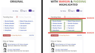
The margins make the text look more organized. also a good friend of margins is the good old padding. as seen in the picture above padding is very important as well.

The margins make the text look more organized. also a good friend of margins is the good old padding. as seen in the picture above padding is very important as well.
Thursday, October 12, 2017
Cartoon Network
No wonder it's a website for Kids.
Cartoon Network's website is interactive, colorful, and fun. To be honest this is the first time I visit their website and I find it very entertaining, so much that it made me feel like a kid once again.
Their categories each have a sub category within. Its funny how they drop and bounce on the screen. its very colorful and lively. most options have a famous character from a show to click on. it was a little too much for me when you pass the mouse over the items on the website, they start to move. is a little distracting but mostly engaging, because it makes me want to click to see more of it.
is it distracting? Yes, but only if I was looking for something in specific, which I doubt I would be if I were a kid looking for a game online.
Take a look at it here
Wednesday, October 4, 2017
A Website I would Like to Create
this post is mostly directed to a friend of mine. He is an artist, but he is very shy. He makes some money of his art, but i know that a website could really help him make himself a name and at the same time give him some income.
His art style is different than most. Always dark with dark tones to them. I like his art specially becasue of that. Because even though on the outside he looks a certain way his drawings always reflect who he feels he is inside, even if the drawings are not of himself.
i would like to make a website for him, becasue even though he has a Tumblr blog, a website would give him more options and probably more people would get to see his work, and start a business. For said website i would use this pictures. In my opinion the following works show his style to the fullest as well as his dedication. personally some of these are my favorites.


I got these from his blog on Tumblr. To check it out click here
Wednesday, September 27, 2017
Comparing Websites
I was talking to a friend who loves coffee, specially coffee shops. She told me about this amazing place in Chili, Rochester; and first thing that came to mind was 'what about their website?'
So I decided to take a look on their website and given my past experience with coffee shop websites I was expecting to see a half good website. Instead I found this . I think their delivery of information is simple and efficient. With simple graphics but the website is dynamic and fun to look at.
On the other, I found this other website about training bartenders or something like that. I would be sure but because of the lay out of their website and the way the information is presented. I have even more questions than answers. Although their website is interactive with some moving graphics. In my opinion, this website isn't the best giving much information. they could improve that by making the information options more noticeable, most of what I see are graphics of the page and it makes it confusing to find the information on the actual purpose of the webpage
On the other, I found this other website about training bartenders or something like that. I would be sure but because of the lay out of their website and the way the information is presented. I have even more questions than answers. Although their website is interactive with some moving graphics. In my opinion, this website isn't the best giving much information. they could improve that by making the information options more noticeable, most of what I see are graphics of the page and it makes it confusing to find the information on the actual purpose of the webpage
Wednesday, September 20, 2017
You Know What's Annoying? : Ads
I like interactive websites that make me wan to click every single thing on the screen. Naturally I'm a curious person that clicks a lot when I'm presented with a new website.
But there are things in some websites that are annoying; understandably there have to be some ads in the website, but some websites abuse this and place so many ads in their lay out that one can't simply trust to click away because one could accidentally click in one of those, of course the point is to make you click the link.
What I dislike about some websites are those annoying ads that look legit options on the website and suddenly they sent you to another thing and are trying to sell you something.
But the most annoying thing I saw in some websites are those annoying video ads, that you don't know when they will be activated. and most of the time activate when you are not looking at that particular tab, and all of a sudden BOOM you can hear audio coming from somewhere and you have no idea where its coming from. So unless you through every tab you're not going to find it. And when you have little to no patience and you close every tab instantly, and for some reason the sound keeps on going. and you realize at some point you were desperate enough and opened explorer and the sound is coming from the tab you never even cared to check.

Subscribe to:
Posts (Atom)